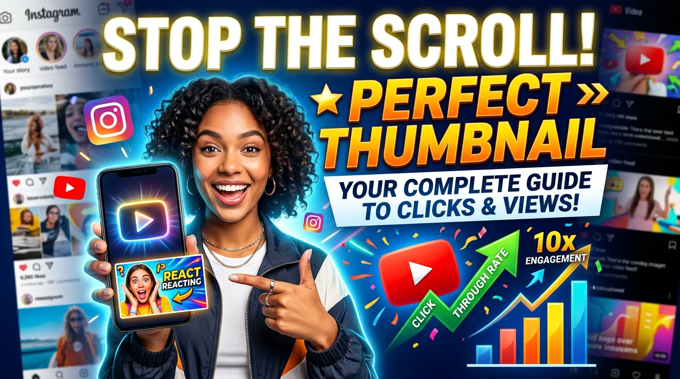
How to Create the Perfect Thumbnail That Stops the Scroll
Your thumbnail is the first thing anyone sees before deciding whether your content is worth their time. It is a split-second visual pitch.
Your thumbnail is the first thing anyone sees before deciding whether your content is worth their time. It is a split-second visual pitch. Get it right and your clicks, views, and engagement multiply. Get it wrong and even your best content gets ignored. Here is how to get it right, every single time.
Think about how you browse YouTube, scroll through Facebook, or swipe through Instagram. You are making dozens of micro-decisions every second: watch or skip, read or scroll, click or ignore. And for the most part, those decisions are made before you read a single word of the caption or the first frame of the video plays.
They are made by the thumbnail.
For small business owners, a strong thumbnail strategy is one of the highest-leverage, lowest-cost improvements you can make to your content marketing. It costs nothing extra to create a great thumbnail, but the payoff in clicks and views can be enormous. Here is a complete guide to doing it properly.
Why Most Business Thumbnails Fail Before They Are Even Seen
Most small business content gets ignored not because the content itself is bad, but because the thumbnail fails to earn the click in the first place.
⚠️ The Painful Reality Check
⚠️ The Hard Truth About Bad Thumbnails
A blurry screenshot, a logo on a blank background, or an auto-generated video frame of someone mid-blink. These are the thumbnails that get scrolled past thousands of times. The content behind them might be genuinely great, but no one will ever know because the thumbnail told them it wasn't worth the click.
✕What Kills a Thumbnail
- ✕Auto-generated video screenshot with no design
- ✕Too much text, too small to read at a glance
- ✕Low contrast between subject and background
- ✕Logo-only design with no human element
- ✕Cluttered layout with no clear focal point
- ✕Inconsistent style across different pieces of content
- ✕Misleading image that doesn't match the content
✓What Makes a Thumbnail Work
- ✓A clear, single focal point that draws the eye instantly
- ✓Bold, high-contrast text with 3 to 5 words maximum
- ✓A human face with a strong, expressive emotion
- ✓A colour palette that stands out against the platform background
- ✓Consistent branding that builds recognition over time
- ✓A visual that creates genuine curiosity or promises clear value
- ✓Legible design that works even at thumbnail size on mobile
The 5 Core Elements of a Perfect Thumbnail
Every high-performing thumbnail, regardless of industry or platform, shares the same fundamental building blocks. Master these five elements and you will consistently create thumbnails that earn clicks.
01. A Dominant Focal Point
Your thumbnail needs one thing to look at first. A face, a product, a bold number, a striking visual. If the viewer's eye doesn't know where to land immediately, they move on.
02. Bold, Minimal Text
Use 3 to 5 words maximum. Your text should add context that the image alone doesn't provide. Choose a heavy-weight font, high contrast colour, and a size that is readable on a phone screen.
03. High-Contrast Colours
Contrast is what makes your thumbnail visible in a crowded feed. Use a background colour that is distinctly different from your subject. Bright against dark or dark against bright. Never similar tones side by side.
04. Human Emotion (When Possible)
Faces are the most powerful visual element in any thumbnail. The human brain is wired to look at faces before anything else. An expressive emotion, whether curiosity, surprise, or excitement, communicates instantly and creates connection.
05. Brand Consistency
A thumbnail is not just one click. It is one piece of a visual identity. Use consistent fonts, a recurring colour palette, and a recognisable layout style so that viewers learn to spot your content in a feed before they read a single word.
The Anatomy of a High-Click Thumbnail
Understanding where each element lives and why is the key to designing thumbnails that are both visually appealing and strategically effective. Here is how the best-performing thumbnails are structured.
- Expressive Human Subject: Occupies the left third of the frame. Eyes are sharp, emotion is clear.
- Headline Text Block: Bold primary text in the upper right. Maximum 5 words.
- Brand Badge: A small, consistent identifier in the lower portion so it doesn't compete with the headline.
- Visual Cue or Accent: An arrow or highlight that guides the viewer's eye toward the most important information.
Text on Thumbnails: Less Is More, Bold Is Everything
Text on a thumbnail has one job: to add a piece of information that the image alone cannot communicate. It must be large, bold, and brutally short.
- Keep it to 3 to 5 words maximum. If your thumbnail text needs more than five words to make sense, break it into a headline and a two-word sub-line.
- Use ALL CAPS or Title Case for the primary text. It reads faster and creates more visual weight than sentence case.
- Choose a heavy-weight font. Think bold, condensed, slab-serif, or impact-style typefaces. Thin or script fonts disappear at thumbnail size.
- Create contrast with your text color. White text on dark backgrounds and yellow or bright text on image backgrounds are the two most reliable combinations.
- Add a text shadow or subtle outline if your text sits over a busy image. It makes text legible regardless of what is behind it.
- Test your thumbnail at 25% of its actual size. If the text is not readable at that scale, it is too small or too thin for most viewers to read on their phones.
Step back from your screen and squint at your thumbnail until your vision blurs. Whatever you can still make out is what your viewer will see in a busy feed. If the key text or image is gone, it needs to be bigger and bolder.
Color Psychology: Make Your Thumbnail Impossible to Ignore
Color is not decoration; it is strategy. The right palette makes your content pop off the page.
High-Visibility Yellow
Maximum attention on dark platforms.
Used by top-performing YouTube creators consistently.
Urgent Red
Creates urgency and emotional intensity.
Effective for problem-focused or high-stakes content.
Authority Purple
Premium, creative, and trustworthy.
Stands out strongly on white-background platforms.
Tech Cyan
Clean, modern, and credible.
Works well for business, finance, and technology content.
Action Orange
High energy and motivating.
Excellent for fitness, food, and transformation content.
Pick two or three colours and use them consistently across all your thumbnails. This builds visual brand recognition so that regular viewers learn to spot your content before they even read the title. Think of it as your content's uniform.
Platform Specs and Best Practices
A thumbnail that looks perfect on YouTube may appear cropped and broken on Facebook. Each platform has its own display dimensions, safe zones, and context. Use this reference every time you create a new piece of content.
| Platform | Ideal Size | Key Format Notes | Text Placement | Priority |
|---|---|---|---|---|
| YouTube | 1280 × 720px | 16:9 ratio. Avoid bottom-right corner. | Top-right or upper-left | Critical |
| 1280 × 720px | Can be cropped to 1:1. Keep content centred. | Centred or upper-middle | Critical | |
| 1080 × 1920px | 9:16 ratio for Reels. Keep to upper 2/3. | Upper or lower third | Critical | |
| 1920 × 1080px | Professional tone. Avoid 'clickbait' styles. | Left-aligned preferred | High Value | |
| TikTok | 1080 × 1920px | Keep within the centre safe zone. | Centre, avoid edges | High Value |
Tools to Create Thumbnails Without a Designer
You do not need to hire a graphic designer or learn complex software to create professional-quality thumbnails. The tools available today are powerful, fast, and built for people who are not designers.
Canva (Free and Pro)
The most popular choice for non-designers. Pre-built thumbnail templates for every platform, drag-and-drop editing, a large font library, and a background remover tool on Pro. Start with a template and customise your brand colours and fonts.
Adobe Express
Adobe's simplified creative tool with polished templates and strong text handling. Integrates with Adobe Stock for premium images. Excellent for more professional-looking designs without learning Photoshop.
Snappa (Free and paid)
Purpose-built for social media graphics with exact platform dimensions built in. Faster and simpler than Canva for people who want fewer options and quicker output.
Remove.bg
A dedicated background-removal tool. Upload a photo of yourself or a product and get a clean cutout in seconds. Use this to place yourself or your products against a custom thumbnail background with no overlap issues.
Your smartphone camera (free, always with you)
Authentic, high-quality photos taken against a simple, contrasting background often outperform stock images. Set your phone to portrait mode, use natural window light, and take 10 shots with different expressions. You will always find one that works.
Create a master thumbnail template in Canva with your brand fonts, colours, and layout locked in. Every new piece of content just requires swapping the image and updating the text. What used to take 30 minutes takes 5.
Test, Iterate, and Let Data Guide Your Design
Even experienced designers and content creators do not get every thumbnail right on the first try. The difference between professionals and beginners is that professionals test. They create two or three thumbnail variations, measure the click-through rates, and double down on what works.
YouTube's built-in A/B testing tool lets you test two thumbnails on the same video and automatically shows the winner after a statistically significant sample. On other platforms, you can replicate this by running the same content with different thumbnails in separate posts and comparing engagement after 48 hours.
- Track your CTR. The average is 4-5%. If you're below 3%, your thumbnails need work.
- Test one variable at a time. Change either the image, text, or colour—not all at once.
- Study competitors. Look for patterns in top performers in your niche.
- Refresh old thumbnails. Changing a thumbnail on an existing video can significantly revive its views.
A thumbnail is not a one-time creative decision. It is an ongoing conversation between your content and your audience. Listen to what the data tells you and keep improving.
Your Thumbnail Creation Checklist
Run through this checklist every time you create a thumbnail. It takes under two minutes and will save you from the most common mistakes that reduce clicks and waste content potential.
✅ Pre-Publish Checklist
- The thumbnail has one clear focal point that the eye lands on immediately
- Text is 5 words or fewer, bold, and high contrast against the background
- The design is legible when viewed at 25% of its full size (mobile simulation)
- A human face is included where relevant, with a clear, strong expression
- Brand colours, fonts, and layout are consistent with your other thumbnails
- The image has been tested against the platform's safe zones (no cropping of key elements)
- Background-to-subject contrast is strong enough to separate the two clearly
- No key text or imagery sits in the bottom-right corner (YouTube timestamp zone)
- The thumbnail accurately represents the content it leads to (no clickbait mismatch)
- The file is exported at the correct resolution for the target platform
- At least one alternative version exists for A/B testing on high-priority content
Ready to Build Thumbnails That Actually Get Clicked?
Your content deserves to be seen. Start creating thumbnails that stop the scroll, earn the click, and make your brand impossible to ignore in any feed.
CREATE SCROLL-STOPPING THUMBNAILS WITH BRANDSTORM -->